


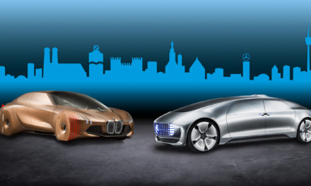
After more than 20 years, the BMW brand has a new corporate identity for online and offline communication purposes. The BMW, BMW i and BMW M communication logos have been completely reworked, with a new logotype and new design principles. The BMW brand now delivers on the expectations and visual style of today and is better-suited to the digital age.
The new design is an expression of the revised brand identity, which places the customer at the centre of all activities. Pared-down and two-dimensional, it conveys openness and clarity. The additional transparent version of the logo is a more open invitation than ever for customers to join the world of BMW. The change reflects BMW’s transition from centring purely on the automotive world to being about technology and connections.
The latest look of the BMW brand is geared towards the challenges and opportunities of digitalisation. The redesigned logotype expresses openness and strength of character to ensure a contemporary, future-proof presence both on- and offline.
“BMW is becoming a relationship brand. The new communication logo stands for openness and clarity. We want to use this new transparent version to invite our customers, more than ever, to become part of the world of BMW. In addition, our new brand design is geared to the challenges and opportunities of digitalization for brands. With visual restraint and graphic flexibility, we are equipping ourselves for the vast variety of touch points in communication at which BMW will be present, online and offline, in the future. This additional communication logo symbolizes the brand’s significance and relevance for mobility and driving pleasure in the future”,
says Jens Thiemer, Senior Vice President for Customer and Brand BMW.
Read the story of the BMW logo and find out about its origins and meaning at www.bmw.com.
Source and photo credit: BMW


