


What do you do if you are professional designer, a maven of user experience, a transplant from Finland and you ride the New York City subway everyday? You redesign the map of course.
Tommi Moilanen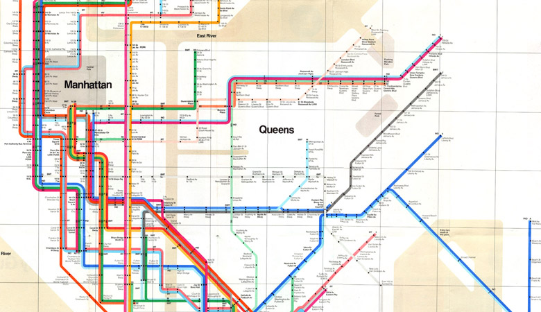 works “at the intersection of interaction design, industrial design and service design.” In other words, if you benefit from one of his concepts, you’ll have a better user experience
Making maps is outside of his usual work, but when you come from a place of artistry and experience you can’t help but look at the world that way. And if you live in New York for at least a year, you essentially become part of the ecosystem — either moving along and playing your part or being observant and seeing room for disruption. “I had the idea long before I started the design. Using the subway everyday, I realized things could be improved. I was also fascinated with the Vignelli map,” says Tommi.
his map, as commissioned by the Metropolitan Transportation Authority (MTA) and designed by Massimo Vignelli, was unveiled as the official New York City subway map in 1972. It was the stuff of precise cartographers’ nightmares. As the New York Times put it: “The map was, indeed, riddled with anomalies, but that was the point. Its designer… had sacrificed geographical accuracy for clarity by reinterpreting New York’s tangled labyrinth of subway lines as a neat diagram.”
Read the full article on 360.here.com
Author: Lori Castle


