


Content created by airlines is distributed mainly on Facebook and Twitter, and the majority of content lacks revenue driving potential.
NB: This is a guest article by Simon Heyes, co-founder of 8 Million Stories (8MS).
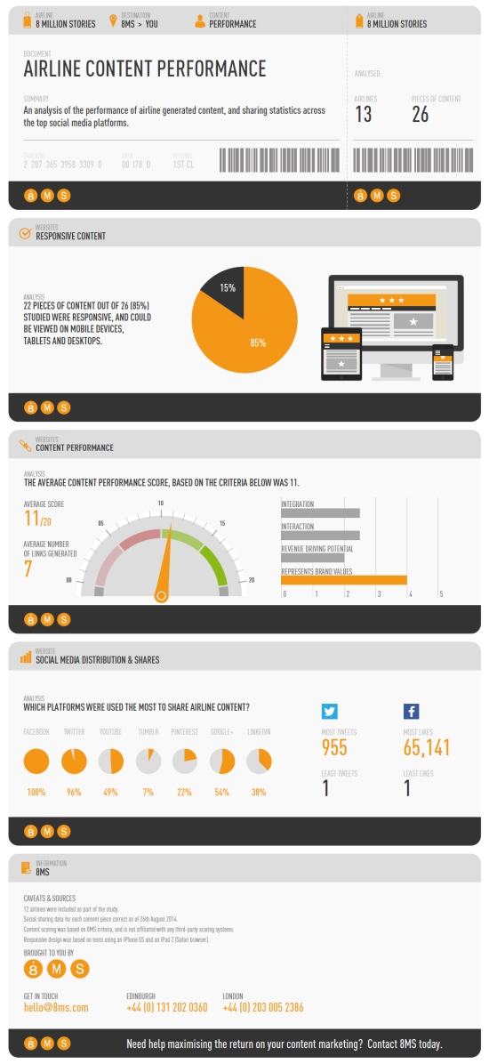
Following on from our airline technology study earlier this year, we analysed content in terms of responsive design, looked at content performance in terms of key digital metrics, and which social platforms were used the most to share the content.
The study analysed two different pieces of content for thirteen different airlines, covering 26 pieces of content in total.
Responsive content
Our study looked at how well content performed on different devices. With many users now consuming content on both mobiles and tablets, we wanted to determine what percentage of the airlines content was viewable on desktop, mobile and tablets.
Our study found that 22 our of 26 (85%) pieces of content were responsive, and could be viewed on mobile devices, tablets and desktops.
Is responsive design the best option though? Not always, as we found out.
As we mentioned in our previous study, mobile usage, needs and tasks often differ from that of desktop browsing, so sacrifices are often made in order to allow airlines to provide the best experience to users.
SWISS, whose World Of Swiss campaign came out top in our content performance scoring, is only available on desktop. Due to the high definition imagery, videos and unique navigation, the best experience is only possible on a desktop device.
Content performance
We often find many brands miss a trick when it comes to creating content and ensuring each piece of content is on-brand, and works in synergy with all other digital marketing activities.
As such, we wanted to create a scoring system which analysed four different areas. Each area was scored out of five, giving a total of 20 points for each piece of content.
The four areas we looked at were as follows:
1. Integration
How well did the content integrate with other channels? Did the content encourage sharing? Was there a unique hashtag used with the content? Is the content sat on a separate domain / URL, did it link through to the main site? If the content targeted a particular destination or package, did it integration with the destination content on the main airline site? Was the content optimised for SEO purposes?
2. Interactive
Did the content allow users to take control? Could they navigate the content by clicking or scrolling? Were users encouraged to share the content on social platforms? Was the content made personal to the user in any way?
3. Revenue Driving Potential
Did the content link back to the main site, specifically with the aim of driving conversions? Could revenue and ROI be easily tracked back to the content?
5. On-brand
Did the content reflect the brand image? Was the content designed with the airlines’ core brand values in mind?
We found the average content score, across 26 different pieces of content, was 11/20.
Whilst the average “on-brand” score was 4/5, we found the majority of content was lacking integration with other digital channels and activities, many of the pieces of content were not interactive, and very few had revenue driving potential.
The top scoring content was World Of Swiss, which scored 18/20.
World Of Swiss provides an immersive look into Switzerland as a country, and Fly Swiss, it’s national airline.
The user can navigate, scroll and click on any area they want to know more about, from Swiss traditions and Swiss food, through to Swiss cabins and its plane fleet. The site was also recently awarded the FWA Site Of The Day in June 2014.
The lowest scoring piece of content was Austrian Airlines’ Summer Splash party flight, which scored 7/20.
The video:
Additionally, we wanted to know how the content performed in terms of generating links, for SEO benefit.
Our study found that the average number of links generated by all the content pieces was only seven links. This data was analysed using Moz Open Site Explorer, and was calculated using “Only links with equity”, and “external only”.
Social distribution
As expected, Facebook and Twitter were the main social media platforms used to share the content with the airlines audiences.
A full 100% of the content was shared on Facebook, and 96% of all the content analysed was shared on Twitter.
Despite it’s continued growth, Google+ only accounted for 54% of all shares. At the other end of the scale, only 7% of content was shared on Tumblr, and 22% was shared on Pinterest.
In terms of the most amount of Facebook likes, the Qatar Airways Land Of FC Barcelona video generated over 65,000 likes, with the SWISS “The Swiss Explorer” coming second with 4,262 likes.
On Twitter, World Of Swiss generated 955 tweets, with South African Airways Taste South Africa competition generating 552 tweets.
Conclusions
Whilst a lot of airline content hits the right notes when it comes to on-brand content, it seems there are still lessons to be learned about content integration with other channels, as well as ensuring content is distributed to as wide an audience as possible.
Content marketing should not just aim for brand awareness. It should be tangible.
The content should help tell a story that connects an audience with content, and in turn, deliver a positive ROI.
NB: This is a guest article by Simon Heyes, co-founder of 8 Million Stories (8MS). A version of it originally appeared on the 8MS blog here.
NB2: Here is in the infographic with some of the results (click for a larger version):

NB3: Airline models image via Shutterstock.


